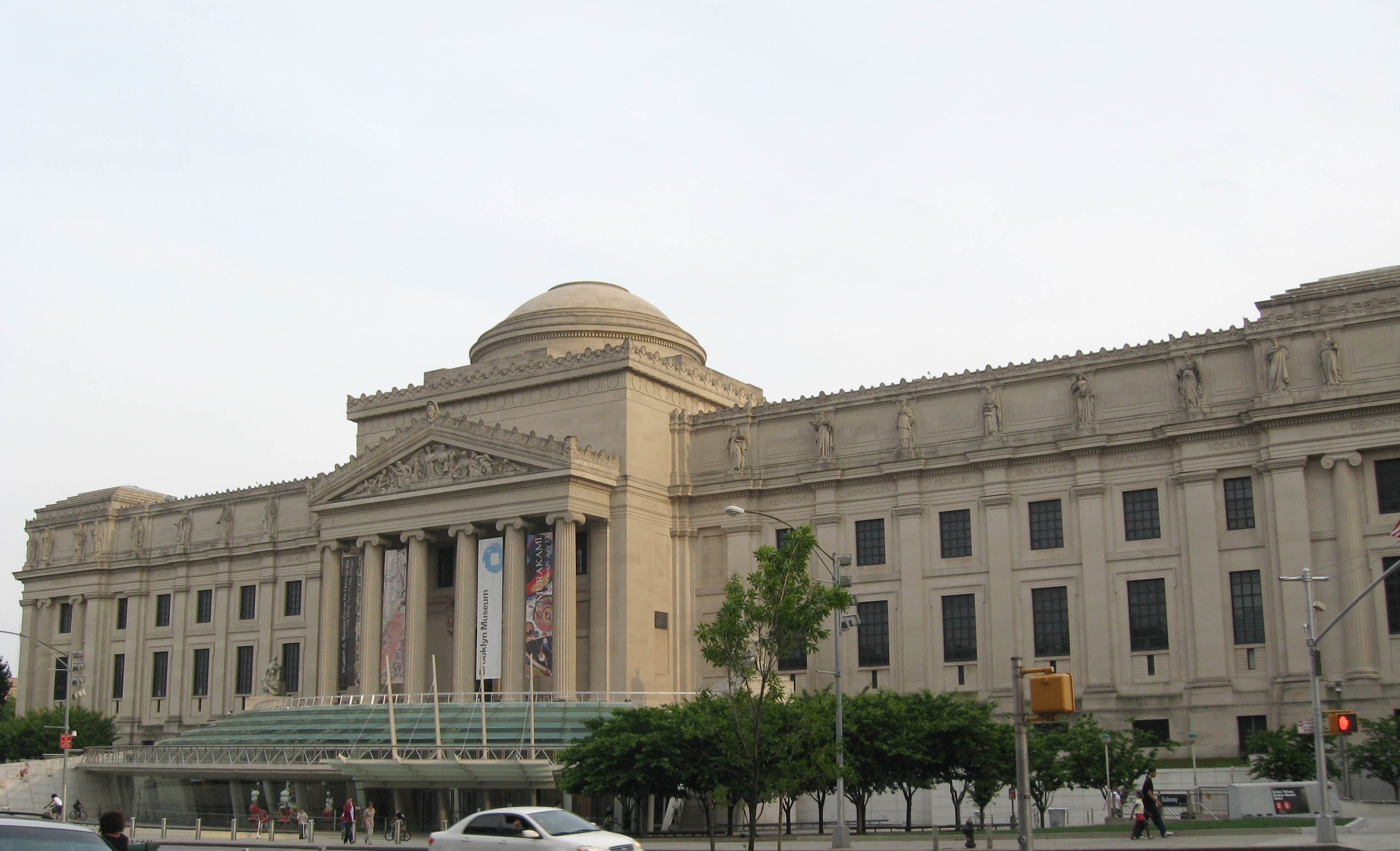
Yesterday, Jen and I went to the Brooklyn Museum to see the
Killer Heels exhibition. But also to see some of the rest of the Museum.
 |
| Source: Wikipedia |
Neither of us had been there before, so had no idea what to expect. First, I have to say that I was a little confused at first, then impressed. Walking up to the building, I'm staring at this strange ultra-modern entrance where in any other museum, I'd expect to see a grand stairway.
 |
| Source:
Brooklyn Public Library, Brooklyn Collection
(SUB 0184) |
Looked up some history, and found it - sadly, can't find it without the context being construction of the subway. A two story grand stairway used to lead up to the front doors. The crazy modern entrance was added in 2004, but it turns out the stairs were removed way back in 1934 (only 10 some years after the museum's original construction plans were completed). It's heartening to think that even back then the museum board was thinking of things like accessibility.
 |
| Source: Brooklyn Museum |
Honestly, I think this site would have shocked me even more. It is ugly. It seems that even in the 1930s there could have been a more creative way to make the building accessible from the ground floor. However, it seems that this is the way the building was presented to visitors between 1934 and 2004.
There's a parking lot in the back, there must have been an accessible doorway back there. How else would big statues come in and out?
 |
| Source: Brooklyn Museum |
Once inside, I was quite surprised at how much stuff was there. I've been in plenty of very big looking museums where there was very little space actually available for public view, and this museum is definitely not like that. All five floors have areas that are open to the public.
We did not plan for a full day, and we should have. We will definitely be going back to see the majority of the museum that we didn't get to see.
If you are, or have ever been fascinated by high heeled shoes, I seriously suggest checking out the
Killer Heels exhibition, which closes on March 1.
 |
| Source: Brooklyn Museum |
Another thing to point out (I was greatly impressed by this) is a room on the fifth floor called the
Visible Storage Study Center. It is basically a glass cased warehouse of stuff that wouldn't fit in the rest of the museum. There are iPads and hanging catalogs instead of individual placards. If I see something I like, I type the catalog number into an iPad, and the details come up. To me this felt more interactive, even though a lot of the collection couldn't even be seen very well (like items on high shelves).
Anyway, I'm impressed. Be sure to add it to your list if you are a Museum buff.


